
.svg)
.svg)


Clayfield Commons is a new development going up in Niagara-on-the-Lake: a hotel, a restaurant, markets and makers, a grocer, a few everyday shops, and a green in the middle of all of it. Three separate businesses sharing one address, and none of them open yet. CARTESIAN was brought in to brand the place itself. When you brand a business, the thing already exists. You look at it, talk to the people running it and the people buying from it, and find the sharpest way to say what is already true. A place that has not opened gives you none of that. No sales history, no guests to interview, nothing to photograph. You are deciding what a patch of ground is going to mean to people before there is anything there to visit.
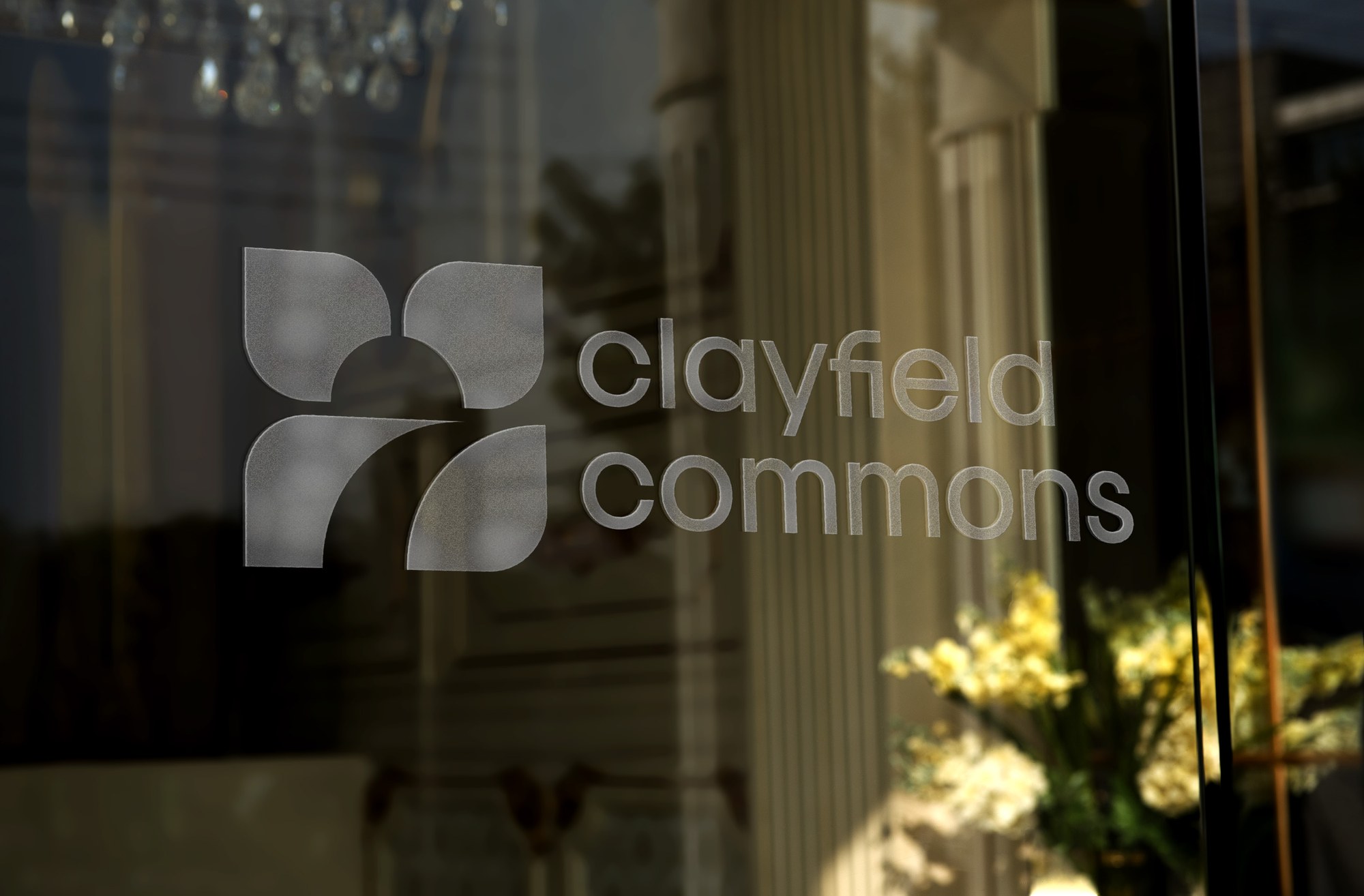
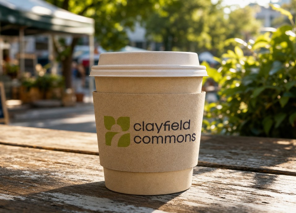
Give a hotel, a restaurant, a market, a grocer and a dozen independent shops a single identity they could all live inside without losing their own voice. The brand had to make Clayfield Commons legible to the town before a single door opened, and it had to hold up on a road sign, a coffee cup and a paving stone as well as it did on a slide.
The first real problem was what to call the commons. Community centre read corporate. Plaza and piazza sounded right and fit nothing about what ownership was building. We landed on hub: a clear, articulate answer to how the people of the town and the tourists would congregate, and a hub for all things community, not tourist. Then the harder question. How do you position Clayfield Commons as part of the Niagara-on-the-Lake experience when it sits up the street from a downtown core the whole world already knows?

The answer was in the geography. The Commons is far more local than a downtown core packed with tourists, and on the map it sits directionally up from Old Town as you drive into the area. Uptown Niagara-on-the-Lake made Clayfield Commons a friendly neighbour to the downtown, never a rival. Then the audience order, which is the whole strategy in three lines. Locals first, because they come back fifty times a year instead of once. Hotel guests second, already Uptown with the hub outside their door. Visitors third. Flip that order and the locals stop showing up, and then there is nothing for a visitor to find.
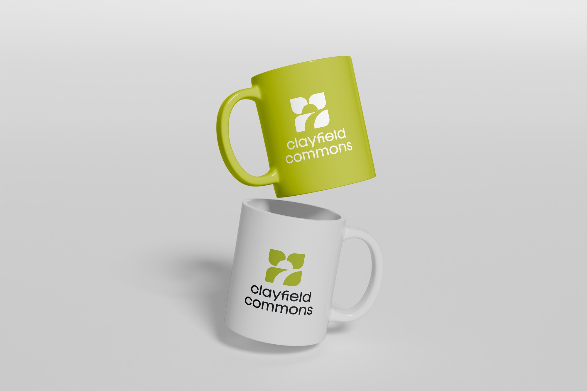
Out of that came a four-part signature, a tagline that closes a piece rather than opening it, and a phrase any business on the property can pick up: Uncommonly ___. Uncommonly Canadian, Uncommonly fresh, Uncommonly local, Uncommonly open. Any shop, any season, no new campaign needed. Uncommonly open is quietly the useful one, because selling the off-season is the hardest job anybody in Niagara has. The logomark followed the architecture. Clayfield was designed by Sidlee Architecture, and the curvature they built into it is a first for the region, so we pulled the same curves into the mark. The building and the brand end up the same shape.
Four parts, one voice, each with its own job. The name, always written in full. The descriptor, Uptown Niagara-on-the-Lake, which is how the place is found on maps, in search and on the road sign. The tagline, Take the whole day. And the sign-off, Uncommonly Canadian, used sparingly so it keeps its weight.
One word, endless ways to fill it. The cafe is Uncommonly caffeinated, the markets Uncommonly fresh, the makers Uncommonly handmade, the off-season Uncommonly open. Every business on the property gets a line of its own without a new campaign, and the whole place still sounds like one place.
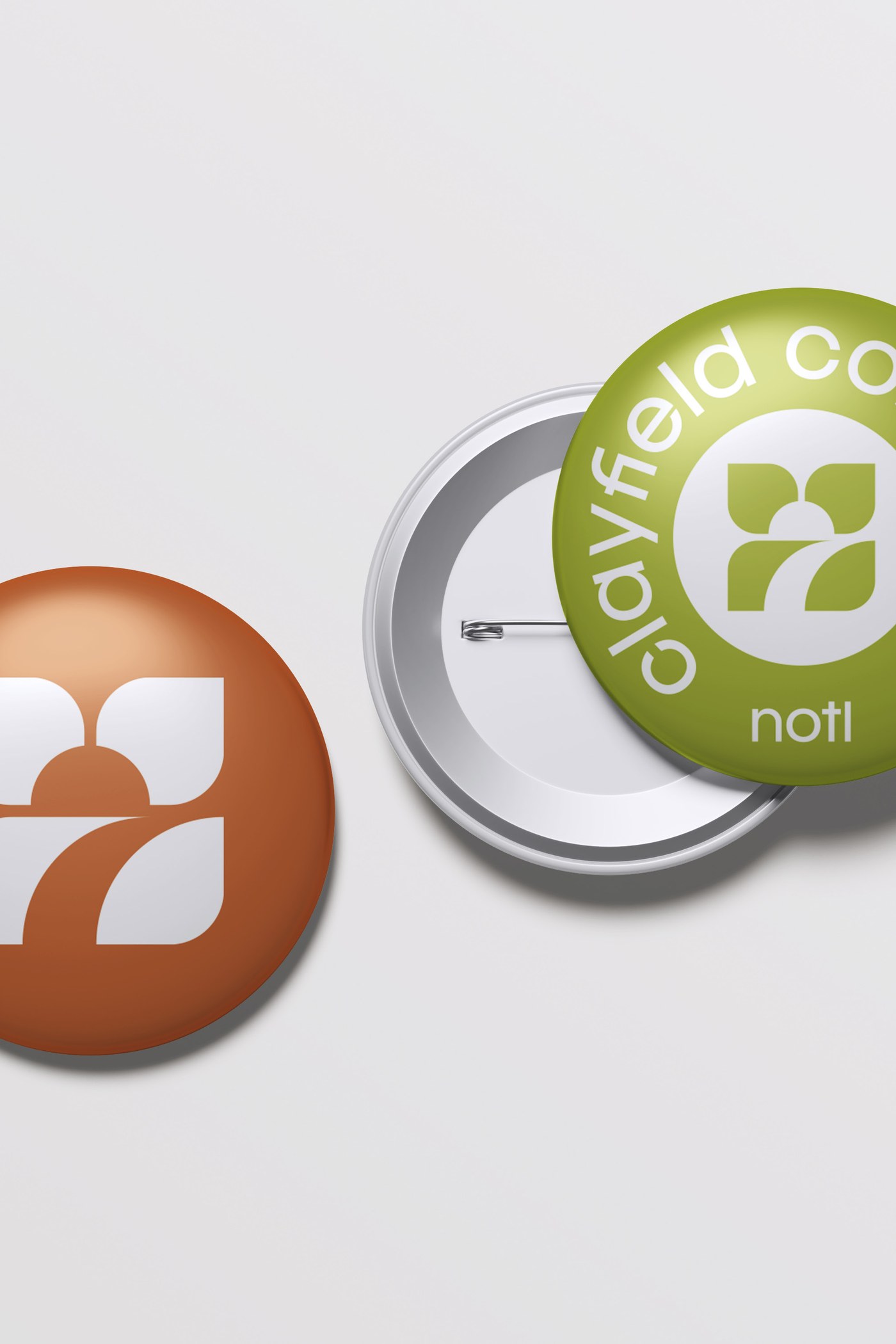
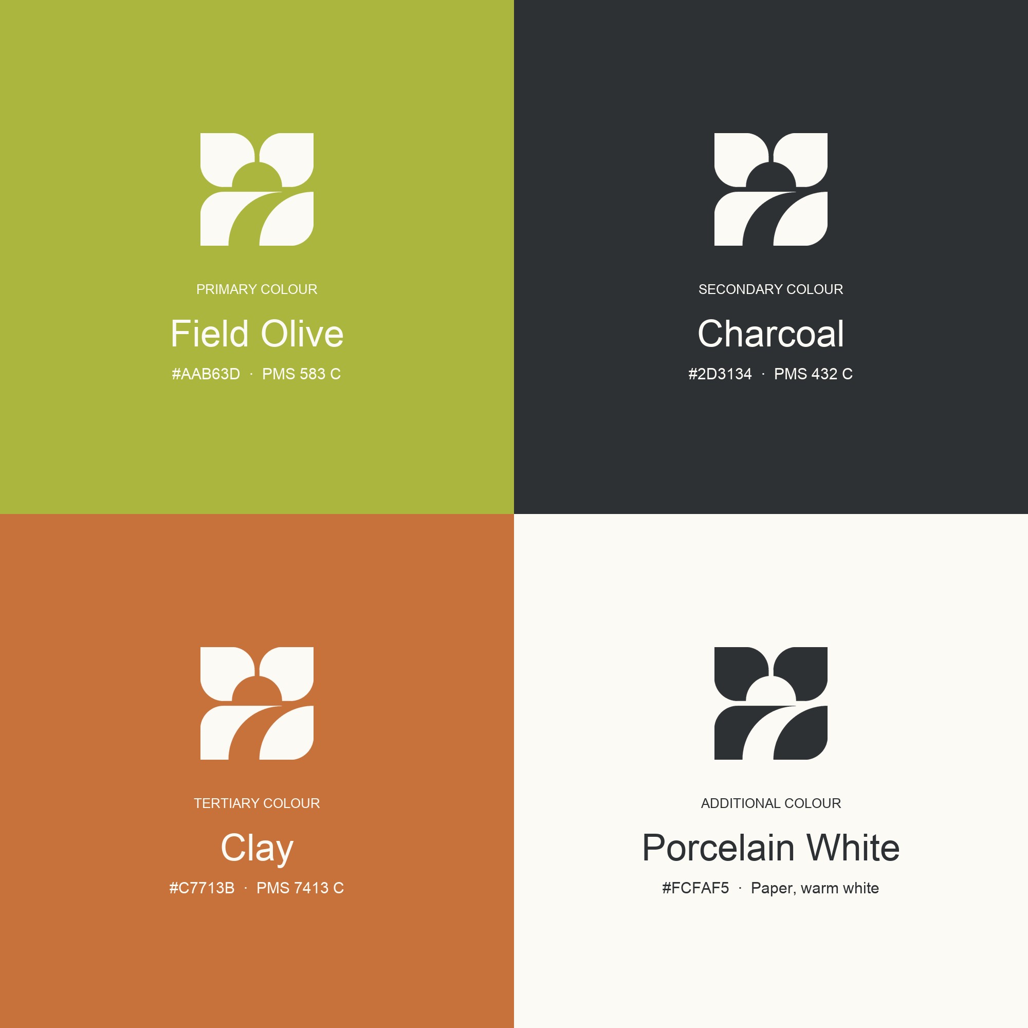
Four soft petals for the planted fields, the path sweeping through the lower field, and the dome of the Green rising at the head. The curves echo the architecture, a first for the region, so the building and the brand end up the same shape. Colours followed the same logic: a planted green rather than a corporate one, a warm charcoal, and clay, which is the name made literal.
Signage and wayfinding, stationery, collateral, social templates and print, plus a section written for the independent retailers operating inside the hub, so a dozen businesses can each sound like themselves without the place coming apart underneath them.
What came back to us was simple. They wanted to deal directly with people who know hospitality end to end, not an account manager passing messages along. The direction was clear. We pushed back in front of executive leadership instead of nodding along in the room and having second thoughts afterwards. And they felt we had a real read on what works in this market, not just what looks good on a slide.
The point is not that a development got a logo. It is that a place was given a position, an audience order and a voice before a single door opened, so every business that moves in inherits a strategy instead of inventing one.
Name the category before you name the brand. Hub, not plaza. The category word decided how the town would use the place before the identity was drawn.
Position with the geography, not against the neighbour. Uptown made Clayfield Commons part of Niagara-on-the-Lake without competing with Old Town.
Sequence the audience. Locals first, hotel guests second, visitors third. Flip it and the locals leave, and the visitors follow them out.
Build the system for the people who will use it. A dozen independent operators can apply the brand without a designer, which is the only way a place brand survives.


.svg)
.svg)
.svg)
.svg)